
When someone lands on your Instagram profile, you have less than 3 seconds to make an impression.
To build your followers sustainably, you need to make sure that your Instagram grid layout stands out from the crowd.
Here are 40 brilliant Instagram layouts to inspire you.
What are the 40 best Instagram grid layouts?
Whether you prefer a chessboard grid, a staircase layout or a tapestry design, here are 40 epic Instagram grids to try this year.
1. The Chessboard Grid

The power of the chessboard or puzzle Instagram grid is in its simplicity. It’s a device that allows you to mix up different types of content, while keeping the consistency that makes for an eye-catching design.
The example above from @sweetersocial also shows the value of sticking to a limited palette, which ensures all of the posts look well considered, on brand, and slot together really nicely. It’s a simple, yet striking way to capture the attention of your audience.
2. The Architecture Grid

The value of sticking to a single theme is shown here beautifully by the University of Leeds. They show impressive restraint, understanding that one of the biggest draws to students is the beauty of the city and university itself.
Furthermore, it’s not just designed for students. Anyone in the area can enjoy their city being represented in such a beautiful way. To keep up this level of quality shows real strategy and dedication. It helps if you’re an expert photographer because the images are stunning.
3. The Digital Design Grid

Showcasing digital work is surprisingly difficult. There are so many ways to do it, from fully mocked up on a device, to full-bleed visuals.
All of these challenges are overcome by Jeaniusagency, which takes real skill. The consistency of lockups, backgrounds and colours creates a perfect mosaic effect, which shows off their digital design in its best light. If you have to show repetitive content, this is a great technique to try.
4. The Product Grid

Today, Instagram is a shopfront for your products. This clever Instagram layout replicates eCommerce stores by showing each illustration individually, with plenty of white space around each one.
This particular account translates sketches and concepts into designs. It’s a smart, clean and beautiful Instagram grid layout that’s perfect for anyone selling their products.
5. The Horizontal Lines grid

Instagram’s grid system lends itself to posting groups of content. You can do it in threes, sixes, or even nines. This example shows the power of threes, making for a beautiful, simple and organised design.
The sharp contrast between the horizontal lines really helps each line stand out as it varies from light to dark, and individual products to mini-grids. The feeling of organisation also extends to the stories, which are all in the same colour and style.
6. The White Spaces Grid
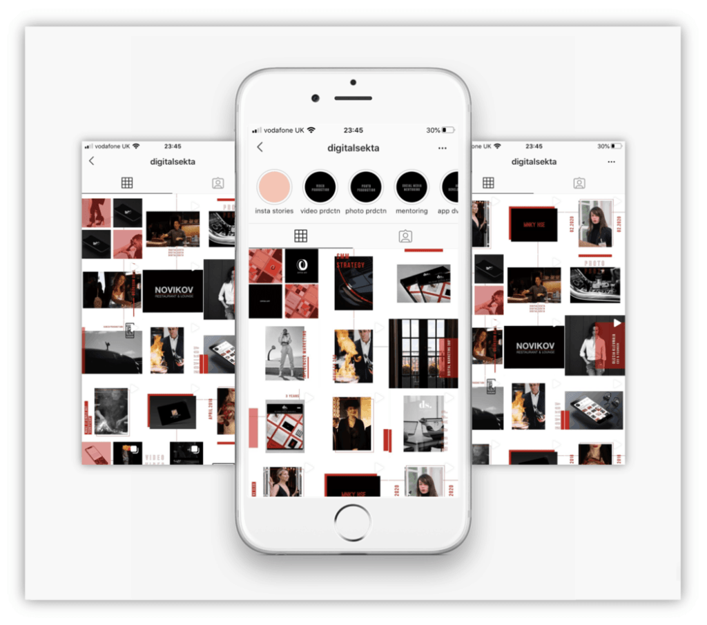
If you come from a creative sector, you might want to try something similar to digitalsekta. What’s really interesting about this Instagram grid layout is the way it uses unexpected shapes, cropping and white space to create a visual moodboard effect.
I love this account because it varies the shapes and sizes of the images. Any variation of square images is a great way to stand out on the platform.
7. The Statement Grid

Instagram is designed purely for images and videos. So what should you do when you need to give people tips, stats and statements?
This account from sociableguys uses a limited yellow and black pattern and really embraces the noisy, chaotic feel. As a result, it looks great, is visually engaging and information really stands out.
8. The Alternating Content Grid
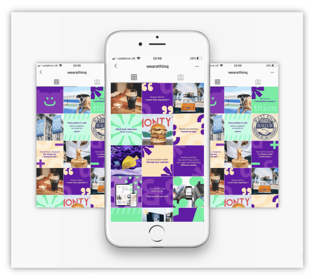
Wearethinq does several things with their Instagram layout that I really like. Their palette is great, with the purples and greens helping to set it apart from the crowd. They’ve also gone a great job adding consistency with the alternating photos and statements.
There’s a lot going on but they do a great job at making their Instagram grid layout easy on the eye, with plenty of variety and eye-catching colours to draw your attention.
9. The Photography Grid

The livuni account has plenty to admire. They do a brilliant job at mixing colours and content types, while still maintaining an organized and coherent feel. They also do a brilliant job at showing off the city of Liverpool, which has a number of stunning buildings and architecture to enjoy.
In terms of content, they mix videos, statics, daytime shots with night time images, and different subjects, from the rainbow heart to a video of Prince Charles. I also love the way they’ve kept things really simple with their story icons.
10. The Infographic Grid
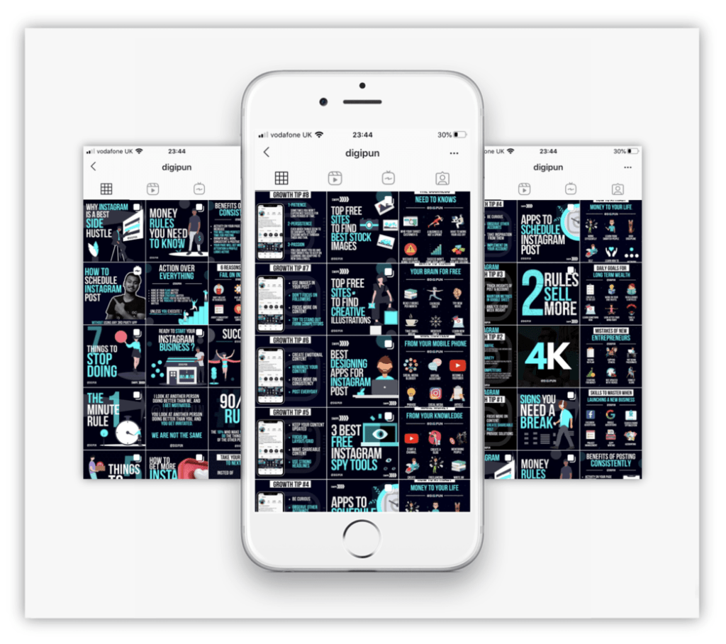
This example from digipun shows the importance of a consistent palette. Their layout shows how it’s possible to show information in a purely visual format.
What I also really like about their Instagram layout is the way they’ve kept the columns consistent. All the images on the left show an iPhone template, while the ones on the right show multiple icons. The central column highlights headlines and stats in a way that is clear and immediately catches the eye.
11. The Headlines Grid

Today, Instagram is primarily a business tool. Which means there are millions of accounts that need to show statistics and headlines.
What I really love about the 1xdigitalagency is the way they use a consistent colour palette, while varying the size of the text to help their key statistics stand out. The stories all use the same orange, which adds an organized feel to their Instagram grid layout.
12. The Alternating Colours Grid

Like most visual platforms, they use of colour is vitally important to making a grid really stand out from the crowd. I love the bold, primary colours used by revivedigital. This helps highlight the content in every image.
Possibly my favourite part of this Instagram grid layout is the care and attention paid to the story icons. With the two-tone colours, it gives off a really professional look and feel.
13. The Influenster Grid

I love accounts that stay true to their theme. The influenster layout does exactly that. It alternates human photography with product shots, which are also beautifully laid out.
Each product is meticulously lined up in a repeating style, arranged at different angles.
It’s this mixture of colours, angles, people and products which come together to make it a great account to follow.
14. The Gradient Grid

The futurelearn logo is a gradient, which is continued throughout their account. What I like is the way that this continues over multiple posts, which shows a high level of organization from their social team.
These bright colours help tie the whole Instagram layout together, helping the content really stand out.
15. The Template Grid

When people follow Instagram accounts, it’s because they like knowing what type of content they’ll see. People love the consistency that comes from the best accounts.
This is taken to a new level by big.empire, whose repeated template shows the text in the same position, in the same font every time. The limited colour scheme and smart gold logo comes together to create a powerful and memorable layout for their brand.
16. The Marketing Grid
The chessboard effect is simple, but when it’s done well it can be extremely effective. By varying their content so dramatically between darker photos and lighter headlines, it ensures that every post and statement stands out.
17. The Digital Grid

Making digital content look good is surprisingly difficult. There’s often a debate about whether to mock it up on screen to show context, or simply show the visual.
One of the best examples I’ve ever seen is this Instagram grid layout from mediaofweb. They use screens, but often extend the images beyond the edges. They also pay great attention to the background colours, which means it looks like a vertical gradient. This Instagram layout also features stunning photography.
18. The Pastel Puzzle Grid

Motivation.digital use the alternating / chessboard effect on their Instagram grid. What I really love is the colours, which vary every other photo, and continue into the instagram stories.
Not only does this make the layout look professional and stylish, it also helps to highlight the headlines and bold typography.
19. The Bold Statements Grid

20. The Abstract Tapestry Grid

I love the tapestry grid layout of digitalstand. Their colours, shapes and highlights spread across multiple panels, which makes one larger abstract picture. Even some of the larger words are spread across multiple images.
They also stay really consistent with their colour scheme, which adds to the overall visual effect.
21. The Information Grid

This is a really. interesting example, as prospects_ac_uk merge information panels with photos and video. They almost see the grid as a landing page, which is a smart way to use the format.
This is a great blueprint for attracting more Instagram followers, since every part of the account is well considered, bright and visually engaging.
22. The University Colour Grid

A big part of a university’s branding is their main colours. Unt do this brilliantly, from their stories to the clothing, flags, uniform and banners. The green runs through every image, which makes for a beautifully consistent grid layout.
Having a great grid layout like this is even more important considering their younger target audience.
23. The Artist Grid

The greatest artists have a singular style. Timmysneaks is one of my favourite contemporary artists, inspired by the likes of George Condo to Kaws.
This singular style continues through to his Instagram grid layout, which has consistent colour, style and lighting. One of the best accounts to follow.
24. The Tapestry Grid

simplywhytedesign is one of my favourite Instagram grid designs. Every image is merged together in a tapestry feel, while the colours are bold, vibrant and really eye-catching.
The content is also nicely varied, from static images to video thumbnails.
25. The Big Picture Grid

Unbounce is known for helping businesses to lower their bounce rate. Their striking Instagram layout mixes bold colours with a stitched design to create an account that feels a lot like a landing page.
Every image is well considered, and the headlines stand out straight away.
26. The Spectrum Grid

The pastel colours in this Instagram grid are stunning. Everything is kept so simple, but it all hangs together beautifully through the complementary tones, right down to the simple story icons.
It means that this account lives up to its name: acolorstory.
27. The Single Colour Grid

Picking one main colour is a great way to keep your look and feel consistent throughout.
What’s so impressive about oisocial is the way that the colour isn’t just based on backgrounds or text. It’s in everything from the clothing to the story icons. It makes for a great-looking Instagram layout.
28. The Rectangles Grid

Breaking up the 3×3 grid is a brilliant way to stand out from 99% of Instagram accounts. The white space around the photos, and the unique cropping makes this style look immediately eye-catching and extremely clean.
It’s perfect if you’re an artist or designer.
29. The Retro Grid

What I love about this design is the retro colours, technology and styles. It looks like a magazine, and the individual images look like polaroids. I also love how the odd black and white photo sits amongst the colours and complements the story icons.
This grid from unumdesign is all about the stunning photography which often has a surreal feel.
30. The Staircase Grid

I love this creative layout by alternate.studios, who bring their name to life by alternating colours throughout their grid. Unlike the more common chessboard or puzzle design, they make up a staircase effect with the contrasting orange and white palette.
The abstract nature of the beautifully-shot posts, from lego bricks to tennis courts, make them an interesting account to follow.
31. The Green Theme Grid

Already in this article there have been examples of accounts that use a single, or multiple colours to create a memorable layout. This account by online.optimism has something a little different.
They execute the single colour theme really nicely, but what I really love are the intermingling illustrations and photography, which makes the posts even more eye-catching. It’s a great example of mixing visual styles and keeping a consistent, coherent Instagram layout.
32. The Vertical Portrait Grid

Quite a few accounts play around with white space around their photos to break up the Instagram grid layout. However, lone_viking_photography only have white spaces on the left and right of the posts, which helps each portrait stand out from the last.
The photos are also stunning, which makes it a perfect portfolio style for any Instagram account.
33. The Story Name Grid

Cave.social is a social media agency, so you’d expect their grid to look great. What makes it really stand out to me is the way they spell their name in their story icons. It’s incredibly striking and a clever way of making use of the layout.
Plenty of companies have neat icons, featuring their logo or a colour scheme, but Cave.social really take it to another level. The rest of their Instagram layout is equally well considered, with a bold yellow and black theme running throughout.
34. The Fluro Grid

The colours are what really make this grid layout stand out from the crowd. It’s a unique and striking palette. Each image has a stunning fluorescent visual, which shows off their brand in a beautiful way.
I really like the cutout abstract style and the way madebystudiojq vary content types, all while making their grid look so consistent.
35. The Theme Grid

bpandopinion use groups of three to theme their content. The layout reflects some of the products themselves, particularly the black and white chessboard in their visuals.
I love how organised and deliberate all of their content looks. It’s clean and perfectly photographed, showing each product in its best light. If you have products to sell or display, you might want to try something similar.
36. The Alternating Gradient Grid

This is a puzzle or chessboard grid with a difference. Instead of sticking to two colours, juice.insp inject plenty of different tones, and always use the white background in between.
It’s a beautiful way of showing digital content because each post is striking in its own right. The subtle gradients add a really professional polish to their design.
37. The Colour Theme Grid

Viral nation keep consistency by being so disciplined about their colours. They use a selection of blues and reds, which cover the backgrounds of each image. This theme extends to their headline text and statistics.
However, what I really love is the way these colours translate into their photos, whether it’s a woman in a blue outfit, or the reds of the neon text. Combining photography and graphic elements, while keeping the colours consistent results in a striking look and feel.
38. The Campaign Grid

I’ve called this one the Campaign Grid because of the way they use different layouts for different types of content.
There are multiple layout styles going on, but they are very clean and ordered about each one. I love how the colours switch from gold and black on the portraits, to showcasing the amount of white space on the facts and figures.
39. The Black and White Grid

There is something incredibly effective about a purely black and white instagram grid. It’s a technique used by many brands over the years and allows stunning individual photographs to sit within a wider look-and-feel.
By keeping the contrast so high, a black and white grid is a great way to keep your Instagram layout looking professional and clean.
40. The Illustration Grid

Bannersnack uses bright complementary colours and illustrations to help their content stand out. I really like the subtlty of the palette, with plenty of different tones used to help make each of their posts eye-catching and on-brand.
The illustrations are a simple, fun way of ensuring that every post is both interesting and informative.
What is the secret to an attractive Instagram grid layout?
There are many, many different ways to make your Instagram grid stand out. However, all the best examples have several things in common:
- They’re consistent. This means they clearly have a well-defined style and pre-planning goes into their content. When this consistency is immediately obvious, it shows the user that you’ve put lots of care and consideration into it, which makes it more attractive to follow.
- They’re on brand. A great Instagram account knows what it’s about, understands its audience and sticks to its message relentlessly. This is immediately obvious in its Instagram grid layout.
- They’re creative. Everybody loves stumbling across creativity. It makes sense that if your Instagram is creative and looks unlike 99% of the accounts out there, you’re going to be a more attractive account to follow.
- It’s highly visual. This sounds obvious. After all, this is Instagram we’re talking about. But the point here is that the visual impact is more important than the message. Humans process visual information much faster than text. This is why there are over 1 billion items on Google Lens and visual search through platforms like Pinterest are helping to change the way we search forever.
What are the best Instagram grid layout tools?
Before I wrap up this guide, here is a quick overview of the best, most flexible Instagram tools that will help you achieve any look and feel. I’ve tested a lot of schedulers in my time – and these are my three favourites in order.
- Later – if you want the simplest, easiest way to plan your grid then Later is my number one pick. Its drag and drop function makes it so easy to visualise and plan your content. Plus, as an added bonus, I love its reporting.
- Planoly – is a great tool for organising your content well in advance, by letting you save your favourite templates. It’s free to sign up – and because it’s official partners with both. Instagram and Pinterest, it’s 100% safe to use.
- SproutSocial – is designed more for corporate Instagram schedulers, and does a lot more than just help you plan content. It’s more expensive, but it does help your content get seen by a wider audience because you can schedule posts across your social networks.
Those are my top 3 – and each will let you achieve any of these stunning grids above.
The best Instagram grid layouts: final thoughts
What really struck me when researching this piece was the incredible number of ways that individuals and companies made their grid layouts look so vastly different.
The creativity across these 50 examples is quite incredible, and there were so many amazing grids that didn’t quite make the cut. The variety was incredibly impressive, from spelling out words in their instagram story icons, to sticking to a consistent colour theme, to building a pattern, or cropping creatively to make up different shapes and sizes.
Today, there are more than 1 billion active users on Instagram and I’ve barely scratched the surface of what is possible. But what’s obvious is that taking the time and care to come up with a creative idea is well worth the effort. These accounts are instantly eye-catching, making it an easy decision to press the follow button.
I hope you’ve been inspired by some of these Instagram layouts. Writing and researching this piece has certainly given me plenty of ideas for my own account. If you enjoyed it, feel free to comment and share.
If you know of any layouts I’ve missed, please send me your best examples to include on my next update!